Archetype Brand
BRIEF:
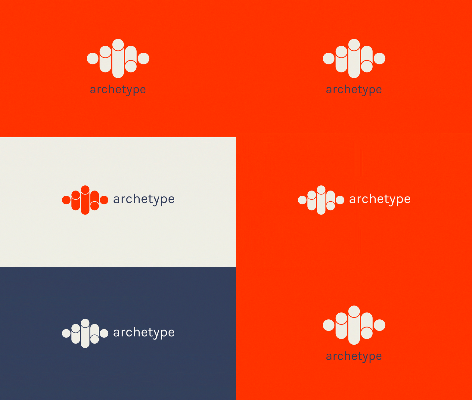
Archetype are an events & activations company who were looking to improve their presence in the marketplace. The brand needed to suit their way of working & have assets that could be quickly rolled out to suit each project.
SOLUTION:
I looked at marks & colours that indicated trust, strength & reliability which I felt were the brand values we needed to convey. I chose a bright, almost industrial orange as their main colour & working with designer Alan Kennington built an abstract ‘A’ symbol referenced how they build stages for events.
We then looked at the situations their staff & equipment would be visible to both public & industry, concentrating spend on that to help them improve visibility overall.
If you’d like to talk about any upcoming projects get in touch here ↗


